Your cleaning company
Two directions. Pick the one that feels like you.
Both of these are finished, working websites — not sketches. Neither one is more correct than the other. They just feel different, and the only thing that matters is which one feels like your business.
Each one comes with a matching client portal — the private page your customers log into to see their calendar, what gets cleaned, and what they’ve paid. Open both so you can see the whole thing, not just the front door.
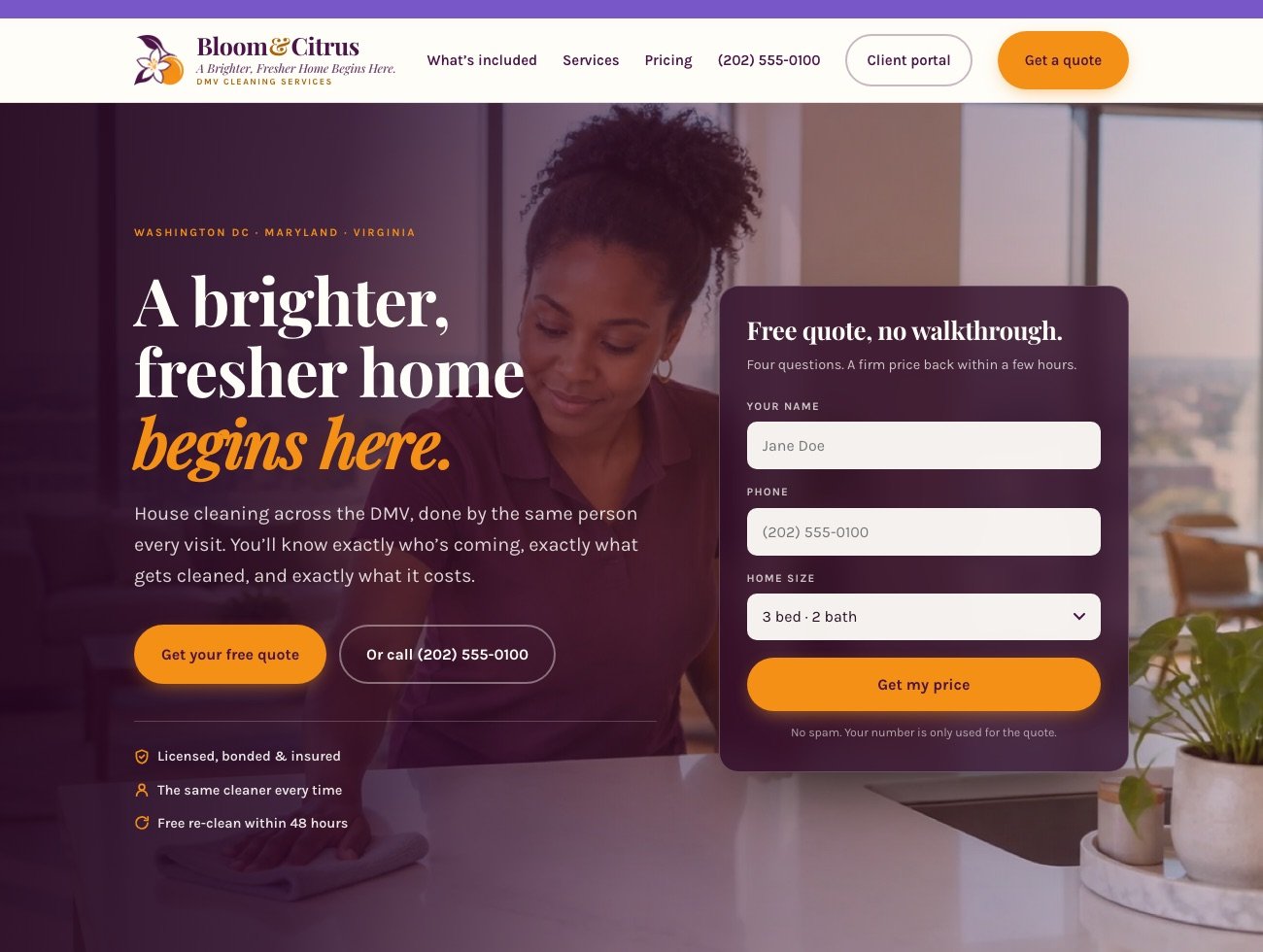
Bloom & Citrus
Calm & premium- Deep plum and warm orange. Quieter, more expensive-feeling.
- Leads with a big photograph and your promise.
- Its standout page shows the full room-by-room checklist — what people actually get for their money.
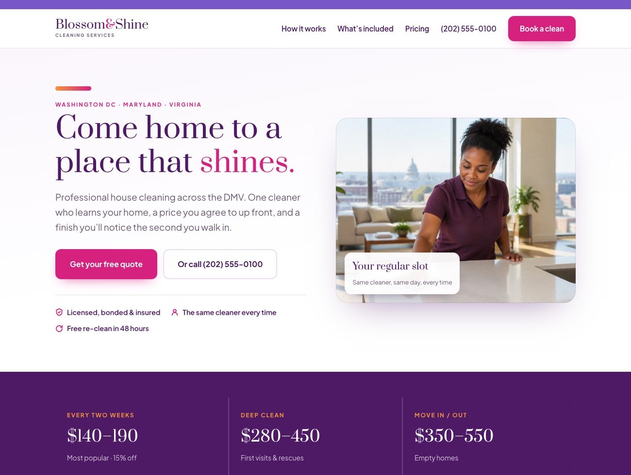
Blossom & Shine
Bright & friendly- Purple, pink and orange. Louder, warmer, more approachable.
- Light and airy, with your prices right at the top.
- Its standout page walks people through booking in four short steps.
Stuck between them?
Don’t study them. Don’t make a list. Open both, look for about ten seconds each, then answer one question:
Which one would you actually want to text to a friend?
That’s your answer. Your gut already knows, and it’s a better judge of this than any amount of comparing.
Nothing is locked in. Colours, wording and photos can all change later, and the whole thing can be rebuilt in the other direction in an afternoon. You are not deciding this forever — you’re deciding what to start with.
A few things on both are still placeholders on purpose: the phone number, the reviews, and the people in the photos. Those get replaced with the real thing before anyone else sees it.